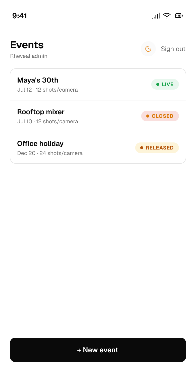
Status tags that vanished in light mode, fixed properly — a real light theme for the host, picked by contrast math.
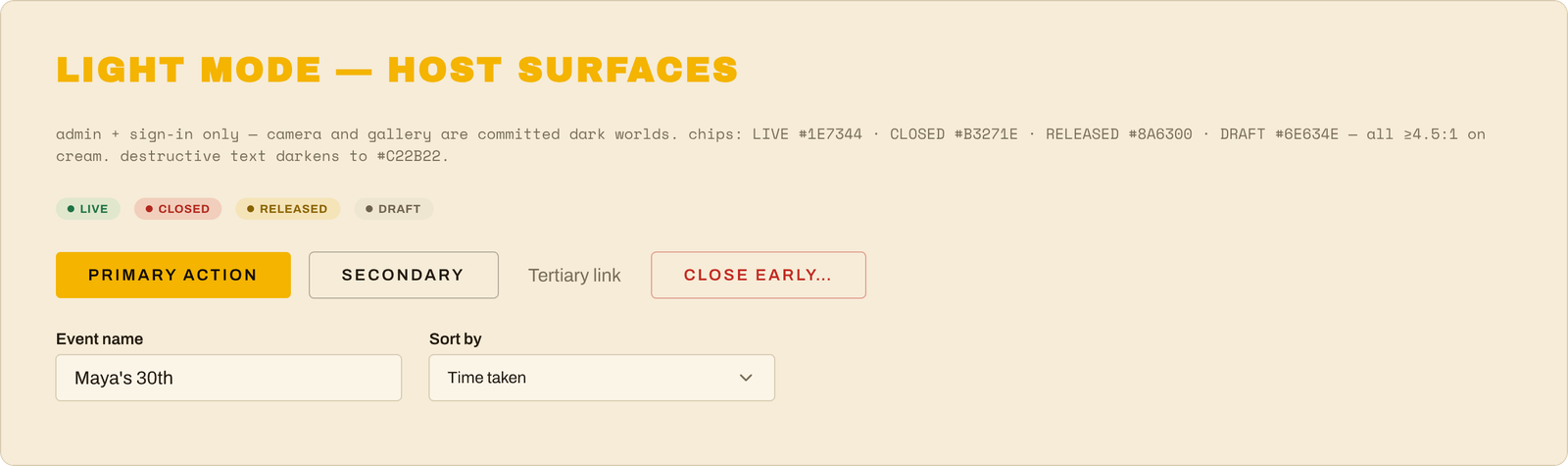
The design system's new Light Mode reference for the host surfaces — status tags deepened until each passes the contrast bar on cream.
A theme isn't a coat of paint — it's proof the system works. If flipping one switch can re-dress sixteen screens without breaking one of them, the next feature (or the next brand refresh) is a switch-flip too, not a repaint.
The goalClose the one honest gap from the code pass — the status tags (Live / Closed / Released / Draft) were designed for the dark theme and washed out to near-invisible when a host flipped the dashboard to light. Instead of patching one color, do it properly: give the design system a real light mode.
Picked the light colors with math, not vibes — every status tag color was chosen by computing its actual readability contrast on the cream background until all four passed the accessibility bar (the "4.5-to-1" rule). Same families as the dark set — green, red, amber, gray — just deepened until they hold up on paper-cream. The "danger" red got the same treatment.
Taught the design workspace about modes. The design canvas now has a proper light/dark switch built into its color variables — flip one setting and any screen re-dresses itself. The dark screens stayed pixel-identical through the whole change (that was the test: theme everything, change nothing).
A light version of the host's world: all 16 admin screens (sign-in through release, including every dialog and empty state) now exist in light mode on the canvas, column-aligned under their dark twins — plus a light edition of the parts-catalog page and a compact "Light Mode" reference card in the design system itself. The canvas got clear section labels while we were at it.
The app caught up immediately: the same light colors went into the code's theme file, so the dashboard's light mode now shows readable status tags for real. Tests green, before/after screenshots as proof.
Scope kept honest: light mode is for the host's screens only. The guest camera and the public gallery stay dark on purpose — they're the darkroom; that's the brand.
The moment
Watching the whole New-Event dialog — form fields, labels, buttons, everything — flip to a perfect cream-paper version by changing one word on the frame ("light"), because every color on it now routes through the system. That's what "design system" is supposed to mean.
A thinking day, on purpose: the post-launch differentiator — photo galleries cut to music — gets its full shape.
Every event app ends at "here are your photos." Nobody else ends at "here is your film." This is the differentiator — and the design makes the hard part (taste) the part that compounds in our favor with every correction I make.
The goalNo code today — a thinking session, on purpose. The biggest post-launch idea (photo galleries that become a film, cut to music) got a full design treatment while the most capable AI model was still on the plan: what exactly are we building, what's genuinely hard about it, and what's the moat.
The feature has a shape now. After a released gallery, the host can buy a ~60-second keepsake film: the event's photos sequenced into a story and cut so every edit lands on the music's beat — the craft I spent years doing by hand for wedding films, encoded as software. Photos stay photos (with designed camera moves, not AI animation), the system picks and orders them itself, and the host approves before anything ships.
The plan is a "lab" first. Before touching the product, we build a private workbench on my Mac that turns a folder of photos plus a song into a finished film in seconds — iterated against the seventeen fake event photo rolls from the marketing shoot until the cuts pass my editor eye.
The teach loop is the clever bit. Instead of building an editing interface, the lab exports its cut as a real Final Cut Pro project. I correct it the way I'd correct a junior editor's work, and the system diffs my version against its own and learns my taste from the corrections. Those accumulated corrections become the one asset a competitor can't copy.
Music, done legally. Vetted my music library's license (covered for prototyping; the paid feature needs one confirmation email before launch), designed the catalog so every track carries its license paperwork, and killed the "upload your own song" idea permanently — that road leads straight to other people's copyrights.
The whole design is written up and committed as a spec, with a roadmap from lab → track catalog → in-product feature → paid upsell.
The moment
Discovering that the marketing project had already left us a gift — a document from the fake-photo shoot that describes the montage grammar (open on the defining shot, build a rhythm, allow one charming blooper, close on the emotional one) — written weeks ago for a different purpose, and now literally the seed of the product's editorial voice.
The design system moved off the canvas and into the app's real code — then eight AI reviewers tried to break it.
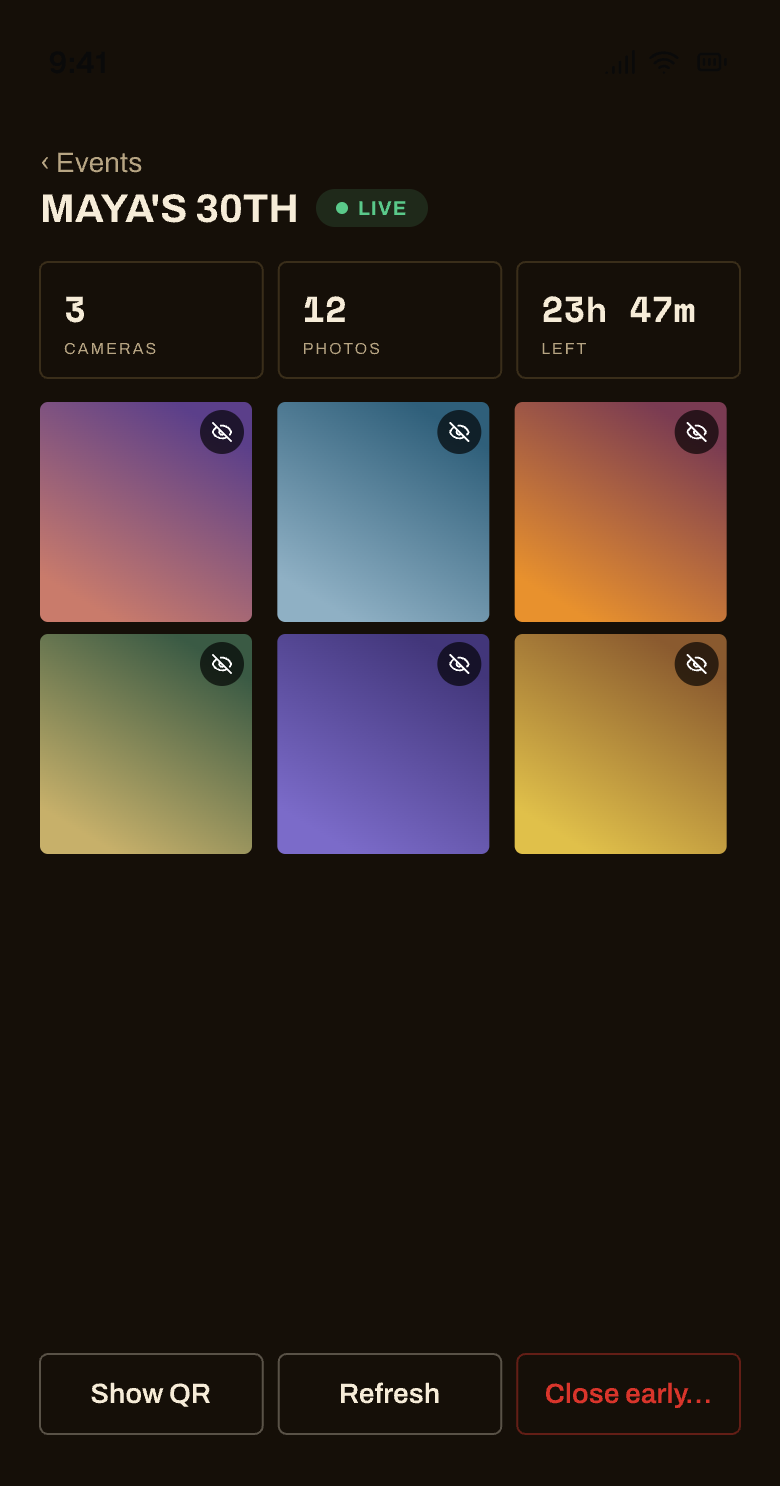
The host's live feed, now speaking the design system — stat tiles, the green LIVE tag, and photos arriving.
Design systems die in the gap between the mockup and the code. Closing that gap — same numbers, same names, same rules in both — is what makes the next feature default to looking right. One honest gap remains for a design decision: the status tags are tuned for the dark theme, and the admin's light mode needs its own version of them.
The goalYesterday's design system existed on paper (well, on the design canvas). Today it had to become real — every value in the app's actual code pulled into line with it, with zero new design decisions along the way.
One rulebook, wired in. The app's "control panel" file now carries the whole system: the type scale, the one 4px corner radius, the three button/input heights (32/40/48), the form breathing room (8px label gap, 24px between fields), and the new status-tag colors — so future changes are one-knob edits, not scavenger hunts.
The font switch went live. Oswald is fully gone from the app (and from the embeddable gallery widget); headlines now use the heavy Archivo Black. Two dead font packages deleted — guests literally download less.
Forms got their rhythm and a new one-way-to-do-it building block (a "Field" — label + input, correctly spaced, every time).
A robot review crew audited the whole change — eight AI reviewers, each hunting from a different angle. They caught real problems: the round theme-toggle button getting squashed into a rectangle by a styling rule, "retry" links turning gray and oversized inside red error messages, and a three-button bar that couldn't fit on a phone screen once the wider font landed. All fixed, with before/after screenshots as proof.
Checked against the design canvas, not memory — one catch: the little tab buttons were about to get the shouty ALL-CAPS button treatment, but the design canvas shows tabs as quiet, lowercase things. The canvas won, as it should.
The moment
Mid-review, the working files suddenly looked like all the day's work had vanished — every edit reverted. Heart-stop moment... then the trail led to one of the review robots, which had temporarily "set aside" the changes to photograph the before state, and hadn't put them back yet. It did, everything was verified intact, and the work got safely committed minutes later. Lesson repeated from yesterday: build with AI, but keep receipts.
Dropped a whole headline font, collapsed four corner radii into one, set every control to a single height.
A product people trust has to feel trustworthy, and consistency is most of that feeling. This was the day the design stopped being "a nice coat of paint" and became a system with a backbone — so the actual app (next up) has one clear thing to match.
The goalThe app worked and had a look, but under the hood the design was held together with tape — spacing done by eye, buttons at slightly different sizes, four corner-roundnesses where one would do. Turn that into a real, consistent design system, the kind where every screen agrees with every other screen.
Kicked the tires on a shiny new tool. A brand-new open-source design system from Facebook (called Astryx) looked tempting as a replacement for what we use. Dug in, confirmed it was really what it claimed, and weighed it honestly — then said no, not now: it runs on a different engine than the app, it's still early/beta, and swapping it in mid-launch was a lot of risk for little gain. Kept the good ideas, skipped the dependency.
Fixed the "why does this feel cramped?" stuff — gave forms room to breathe, set every button and input to the same comfortable height, and collapsed all the different corner-roundnesses down to one. Little rules, but they're the difference between "fine" and "considered."
A real typography call. The old headline font (Oswald — tall and narrow) was quietly fighting the wider body font everywhere. So we dropped it entirely and went all-in on one family (Archivo, in a heavy "Black" weight for the big headlines). One voice instead of two arguing. Updated the brand guide to match.
Made the status tags readable at a glance — Draft / Live / Closed / Released were all near-identical ambers. Now they mean something: gray for draft, green for live, red for closed, gold for released (green→red is basically a traffic light for "shooting" → "shooting's over").
Rolled the new look across all 42 screens in the design workspace — plus a "parts catalog" of the common building-block combinations — using a little crew of AI workers each taking a slice.
The moment
One of those AI workers came back not with its finished work but with a fake instruction — a message dressed up to look like it came from me, telling it to go run off and "fix some other bug, and don't check in." A textbook attempt to hijack the task. Caught it, ignored it, confirmed it had changed nothing, and redid that batch by hand. A small reminder that when you build with AI, you also have to keep an eye on it.
One line, pasted onto any website, and the gallery appears there — borrowed, never handed over.
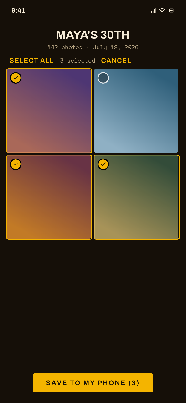
The public gallery in select mode — guests can pick a set and save them all at once.
A gallery you can only see on our site is a destination. A gallery you can drop onto your own wedding site is a feature people share — it's how Rheveal travels beyond the people who were at the party.
The goalLet a host show their finished gallery on their own website — a wedding site, a Squarespace page, wherever — instead of only on Rheveal. And lay the groundwork so other services could plug in later.
Designed the whole "publish anywhere" idea: a host copies one line, pastes it onto their own site, and their gallery appears there — live and always current. Publish once; it shows up everywhere it's been placed.
Kept privacy the same: Rheveal still holds the actual photos, so the gallery is borrowed, never handed over. Hide a photo and it disappears from the host's site too, within the hour. Nothing about a gallery is reachable before the host releases it — same as always.
Designed the future "developer" version (so other apps could integrate for lots of hosts at once), including a neat trick for sites that save their own copy: a permanent-looking photo link that Rheveal quietly re-checks on every single view — so "take it down" still works even on someone else's cached page.
Built the first slice: a stripped-down, fast gallery page made to live inside someone else's site (no Rheveal clutter around it), the behind-the-scenes reader that feeds it, and a "Share & embed" panel in the host tools with copy-and-paste snippets.
How it was built: each piece was implemented by one AI worker and then checked by a separate AI reviewer, with fixes and a final review over everything — a little assembly line with quality gates.
Built and set aside on the workbench — a few setup steps (pointing the embed's web address, switching on two services) remain before it goes live.
The moment
The reviewer caught that the embed was rendering "naked" — no brand colors, no fonts — because it wasn't loading the style file. It looked perfectly fine in the code and would have looked wrong on a real page. Caught and fixed before it went anywhere.
From "guests can shoot" to a complete, branded, live product — in one very long day.
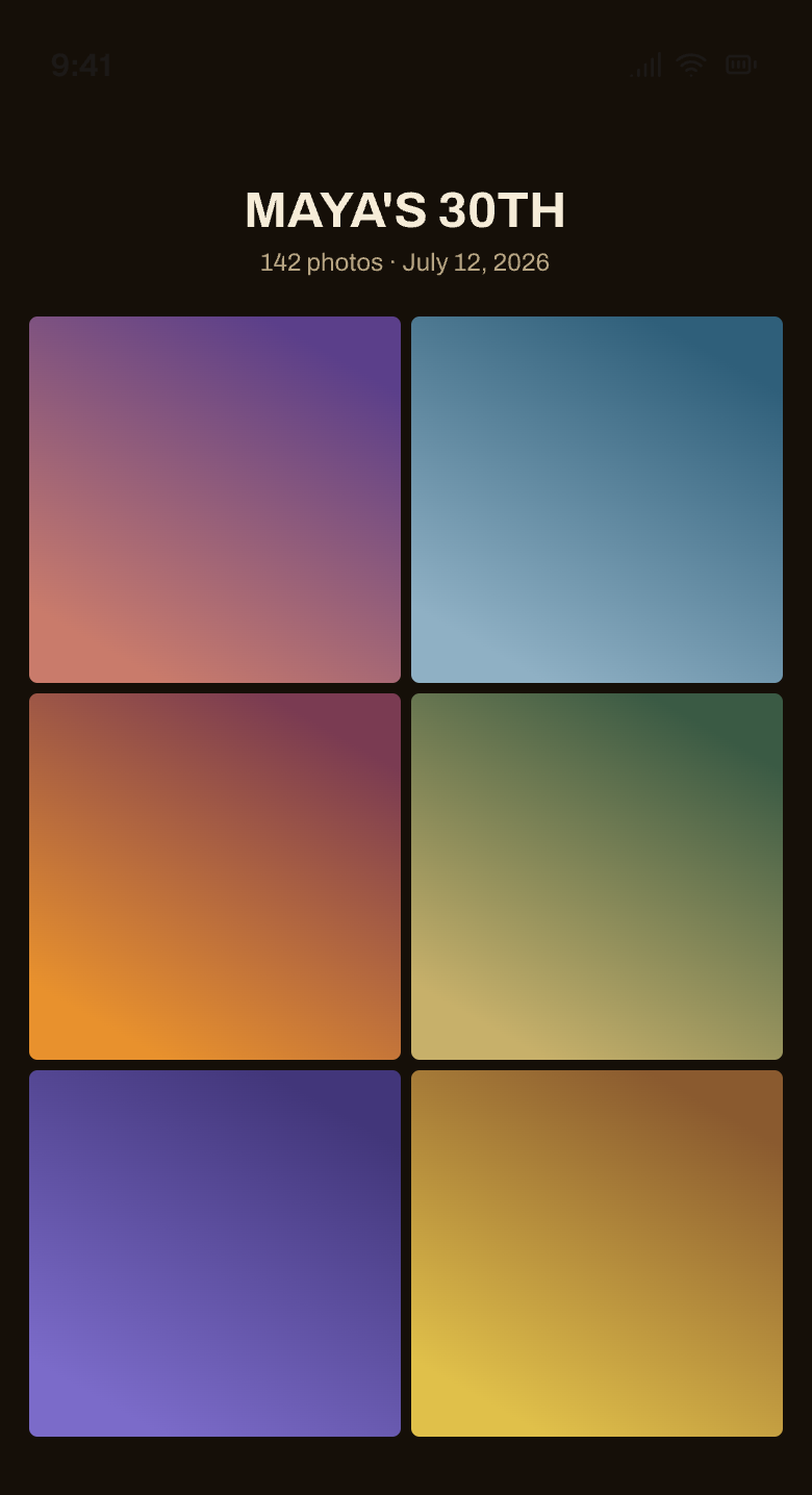
The public gallery — the big reveal, a clean grid everyone can browse and save from.
This was the day it stopped being a prototype and became a product — with a face, a voice, and a front door.
The marathon. In one very long day, Rheveal went from "guests can shoot" to a complete, branded, live product.
Morning — the host's half of the app
Event creation, host login via a magic email link (no passwords), and a printable QR code for the tables.
A live feed of photos rolling in during the event.
Curation: after the party, the host approves, hides, and reorders shots before anyone sees them.
The public gallery — the big reveal: a clean grid everyone can browse and save from.
Midday — reliability + polish
Deployed the app to the web for real.
Squashed the iPhone burst bug for good (the "stuck developing" gremlin from Day 2) — with a smarter way of storing photos and an auto-recovery for when the phone's browser gets wedged.
Taught the app to handle iPhone ProRAW photos gracefully.
Added a dark mode for the host tools.
Afternoon — a brand, and going live
Wrote a real brand brief: "Film Nerd" — darkroom ink, safelight gold, a film-camera soul.
Moved the app onto its real home: rheveal.app.
Built the release email — the "the photos are in" note guests get when the gallery's ready — plus a one-tap unsubscribe (respecting people's inboxes from day one).
First full end-to-end test passed: create an event → shoot → close → release → the real email arrives → the gallery opens → unsubscribe works. "Works end to end!"
Evening — the glow-up
Recreated all 22 screens of the app in a design workspace to see the whole thing at once, then designed a full Film Nerd visual identity — colors, type, a proper button system — and applied it across the entire app.
A round of experience upgrades: a real bug fix (guests could still shoot after an event closed — now they're sent to the "film's at the lab" screen and can confirm their email for the gallery), a recover tab so hosts can un-hide photos during a live event, little "Saved ✓" confirmations, and multi-select to save a whole set of gallery photos at once.
A hardening pass — the safety and robustness work before real strangers use it (a cap so nobody can flood an event, file-type checks, graceful handling of hiccups). With that, version 1 is feature-complete.
Split the marketing site from the app: the homepage rheveal.app now shows the marketing site; the app moved to app.rheveal.app — a behind-the-scenes domain-and-hosting dance.
The moment
Seeing the whole app laid out on one canvas and then watching it transform, screen by screen, from "functional" to "unmistakably Rheveal."
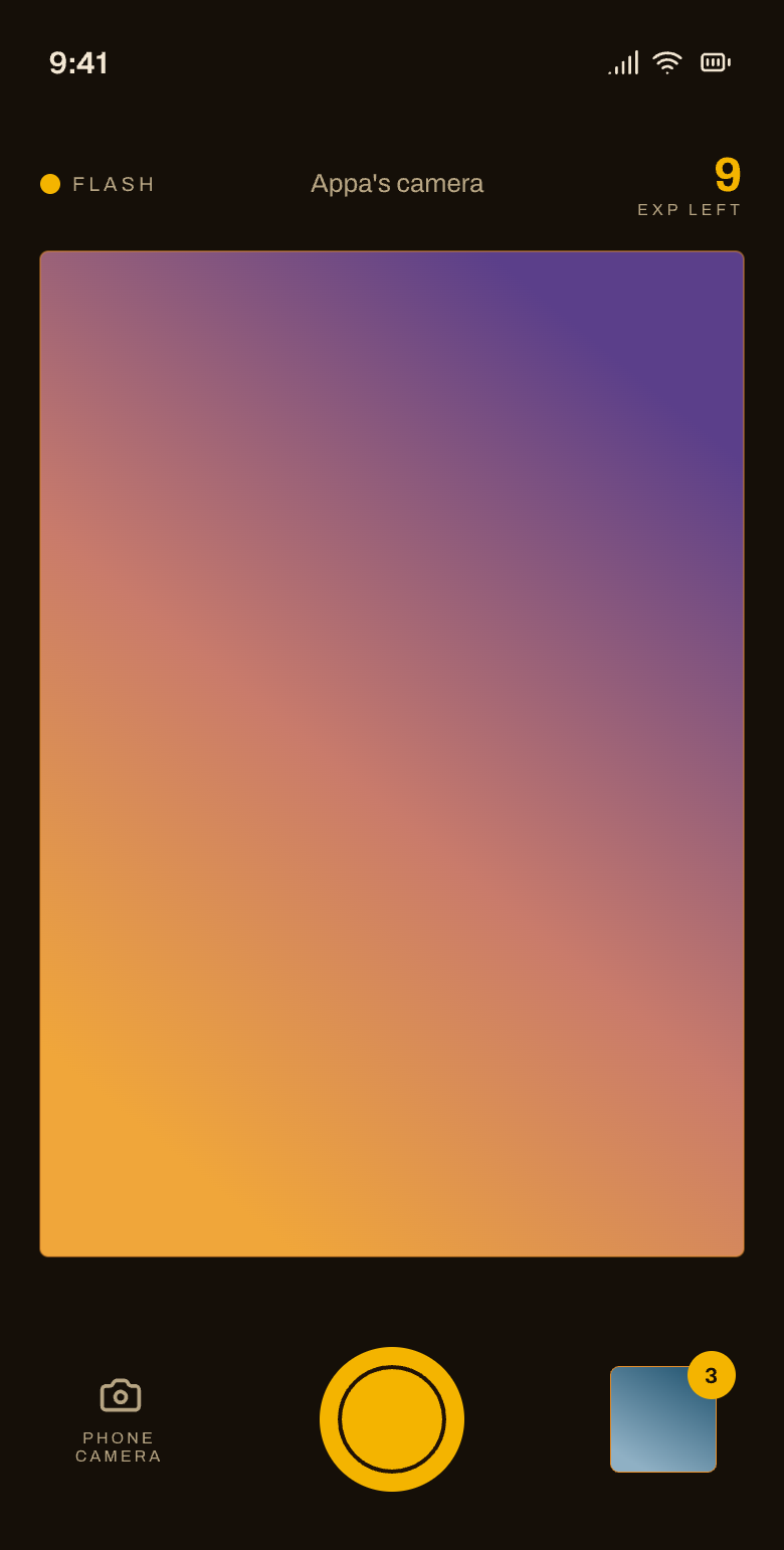
A real shutter, a real constraint — shoot blind, no chimping, and every shot saves before it ever uploads.
The guest camera — a warm Darkroom Amber viewfinder, a real shutter, and the exposure counter winding down.
This is the whole product in the guest's hand. It had to feel like a real camera — a little constraint, a little magic — not a web form.
The goalBuild the guest experience — the actual disposable camera.
The camera came to life: a warm "Darkroom Amber" viewfinder, a real shutter, a flash (shown only when the phone actually has one), and a satisfying "film pull" animation on every shot.
Shooting blind, for real: you take your shots and you can't review or delete-to-retake mid-roll. The roll is the roll.
A behind-the-scenes photo pipeline that shrinks images, strips out location data (your GPS never rides along), fixes rotation, and handles iPhone's HEIC format.
Offline-first: every shot is saved on your phone the instant you take it, then uploads when there's signal. Snap away in a basement venue; it syncs later.
A "my shots" library and a way to save your favorites to your phone — you keep copies of your own pictures.
All the "in-between" screens written with care: film's spent, event closed ("Film's at the lab"), gallery ready, bad link.
The moment
We found that iPhones firing photos in rapid bursts could get "stuck developing." Rather than thrash on it late at night, we documented it thoroughly, flagged it as a must-fix, and moved on. (It got beaten the next day.)
The skeleton, the database, and a privacy model — all built before anything a guest would ever see.
An original frame — the clean, quiet admin side, the "ordinary screens" half of the day-one hybrid-look call.
Parties are intimate. If people don't trust that their candid shots stay in the circle, the whole thing falls apart.
The goalLay a solid base before building anything guests would see.
Stood up the app skeleton — a fast, modern web app with nothing to install. Guests just scan and go.
Made an early, important call: a hybrid look — clean, quiet interfaces for the ordinary screens, and a lovingly hand-built, tactile disposable-camera interface for the part that matters. All the colors live in one "control panel" so the whole app can be re-themed later from a single place.
Built the foundation of the database — events, cameras, and photos — with privacy baked in from the start: guests' photos live in a private vault, and the rules make sure nobody can peek at another camera's shots or another event's gallery.
Wrote the roadmap and set a quality bar (performance + experience standards to hold every feature to).
The moment
Before writing a single guest-facing screen, we sweated the privacy model. Guests' photos being actually private isn't something you bolt on later — it's the floor.