The Host Gets a Light Mode
Status tags that vanished in light mode, fixed properly — a real light theme for the host, picked by contrast math.
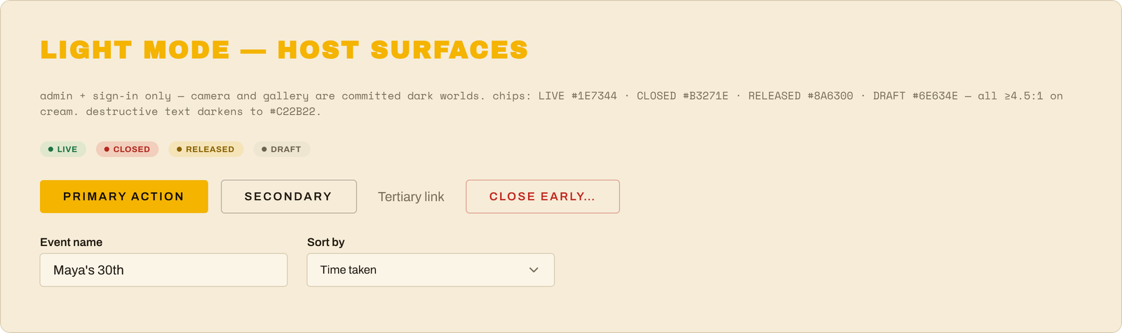
A theme isn't a coat of paint — it's proof the system works. If flipping one switch can re-dress sixteen screens without breaking one of them, the next feature (or the next brand refresh) is a switch-flip too, not a repaint.
The goalClose the one honest gap from the code pass — the status tags (Live / Closed / Released / Draft) were designed for the dark theme and washed out to near-invisible when a host flipped the dashboard to light. Instead of patching one color, do it properly: give the design system a real light mode.
- Picked the light colors with math, not vibes — every status tag color was chosen by computing its actual readability contrast on the cream background until all four passed the accessibility bar (the "4.5-to-1" rule). Same families as the dark set — green, red, amber, gray — just deepened until they hold up on paper-cream. The "danger" red got the same treatment.
- Taught the design workspace about modes. The design canvas now has a proper light/dark switch built into its color variables — flip one setting and any screen re-dresses itself. The dark screens stayed pixel-identical through the whole change (that was the test: theme everything, change nothing).
- A light version of the host's world: all 16 admin screens (sign-in through release, including every dialog and empty state) now exist in light mode on the canvas, column-aligned under their dark twins — plus a light edition of the parts-catalog page and a compact "Light Mode" reference card in the design system itself. The canvas got clear section labels while we were at it.
- The app caught up immediately: the same light colors went into the code's theme file, so the dashboard's light mode now shows readable status tags for real. Tests green, before/after screenshots as proof.
- Scope kept honest: light mode is for the host's screens only. The guest camera and the public gallery stay dark on purpose — they're the darkroom; that's the brand.
Watching the whole New-Event dialog — form fields, labels, buttons, everything — flip to a perfect cream-paper version by changing one word on the frame ("light"), because every color on it now routes through the system. That's what "design system" is supposed to mean.